Live Project · Lead Product Designer
Three Rebuilds To Get One LMS Right
Teesas is an EdTech company delivering accessible learning to students across Africa. Schools were coordinating classes, grades, and parent updates across spreadsheets and WhatsApp groups. Teesas needed one Learning Management System that could serve four different user types (students, teachers, parents, administrators) without collapsing under its own feature list. It took three built-and-shipped versions to get there.
As Lead Product Designer, I owned the process end-to-end, research, ideation, high-fidelity delivery, stakeholder buy-in, and usability testing, across all three versions.
Project Goals
- 01 Create a unified learning experience for students across different age groups.
- 02 Empower teachers with tools to manage lessons, assignments, and assessments.
- 03 Enable parents to track progress and provide support.
- 04 Support administrators with analytics and controls for scaling learning delivery.
- 05 Build a system that was intuitive and scalable enough to drive adoption and retention, not just usable in a demo.
“We needed a platform that could unite students, teachers, and parents in one seamless learning experience.”
, Osayi Izedonmwen, CEO, Teesas Education
Impact
See Outcome ↓Users & Stakeholders
Students
Needed an engaging, gamified learning flow, disengaged quickly when content felt static.
Teachers
Required fast tools for lesson planning, grading, and communication, manual grading was the biggest time sink.
Parents
Wanted visibility into progress and recommendations, with no way to get it beyond asking the teacher directly.
Administrators
Needed dashboards for monitoring performance and compliance, not just raw data.
My Design Process
A Human-Centered Design process, run three times as the product itself evolved:
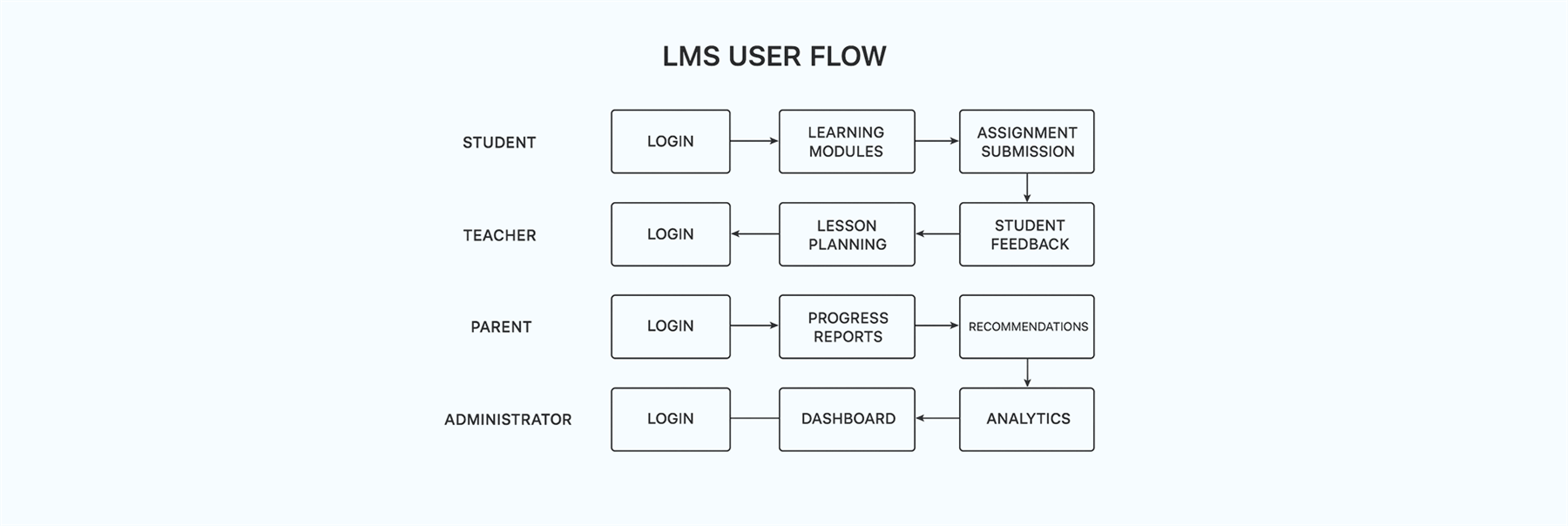
- 01 Discovery Researched students, teachers, parents, and admins to surface pain points, and studied modern EdTech products for opportunities.
- 02 Define Mapped user journeys, built personas, and outlined requirements against a mood board and early wireframes.
- 03 Design & Develop Designed role-specific flows for learning, grading, and reporting. Built prototypes, tested with users, iterated.
- 04 Deliver Collaborated with the project manager and engineers for smooth handoff, keeping the LMS aligned to both user needs and Teesas's business goals.
Discovery · Research & Insights
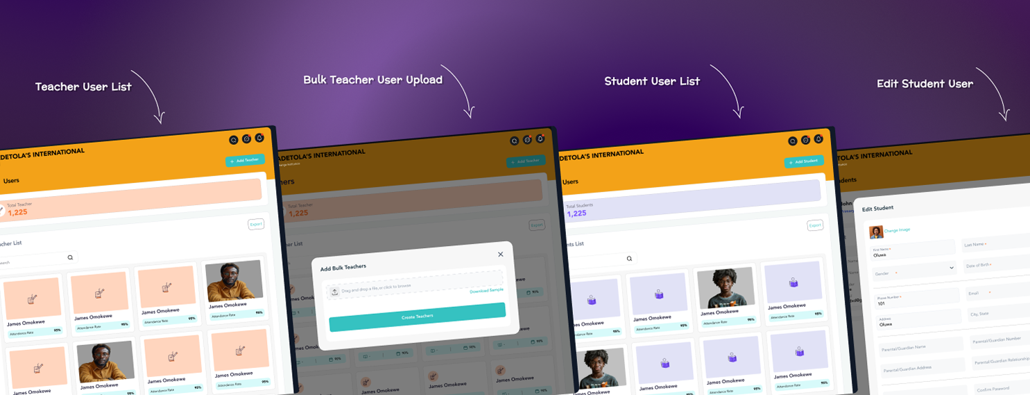
User interviews, surveys, and competitor analysis across all four user types surfaced a consistent pattern: everyone's workaround was informal, and none of the workarounds talked to each other.
Students
Students disengaged quickly when content was too static.
Teachers
Teachers struggled with manual grading and progress tracking.
Parents
Parents lacked visibility into learning outcomes.
Admins
Admins needed analytics that were actionable, not just data-heavy.
Problem Statement
How might we design a multi-role LMS that delivers engaging learning experiences, supports teaching efficiency, and provides transparency to parents and administrators, in one system, not four disconnected ones?
Design & Develop · Three Versions
This is the part of the process most case studies skip: the LMS didn't arrive fully formed. It shipped, got used, and told us what was wrong, three times.
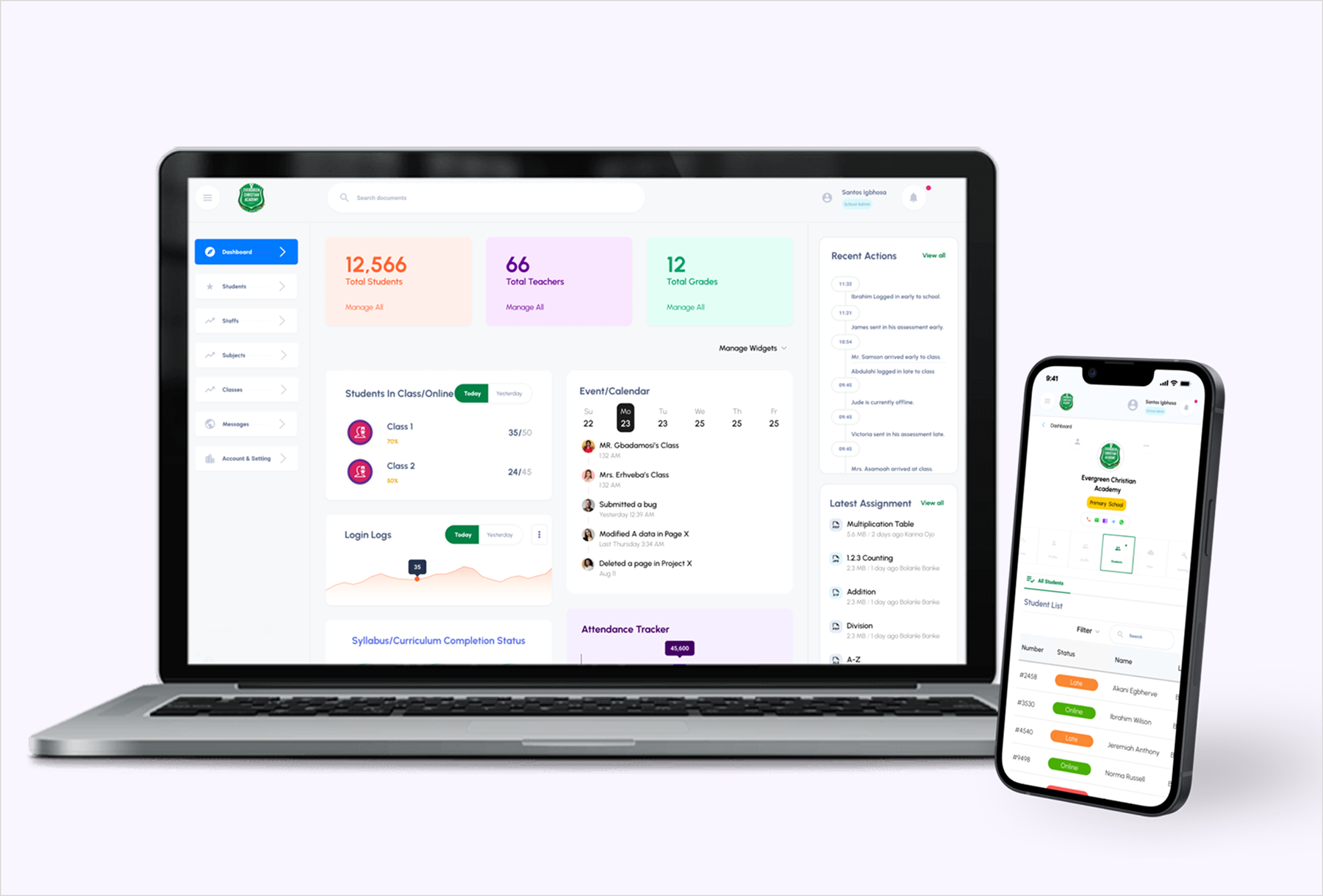
V1 · First Version · The MVP
Built on contract for a state-backed education initiative, aimed at aligning stakeholders and gathering early feedback before a broader rollout.
Goal
Build a quick prototype to showcase the concept and secure stakeholder alignment.
Approach
Focused narrowly on core LMS features, course listing, basic assessments, reporting.
Insight
Helped stakeholders see the concept, but revealed real usability gaps, navigation struggles, not enough admin control.
Learning
Speed and clarity get you alignment. Real user needs only surface after real interaction.
V2 · Second Version · Going Wide
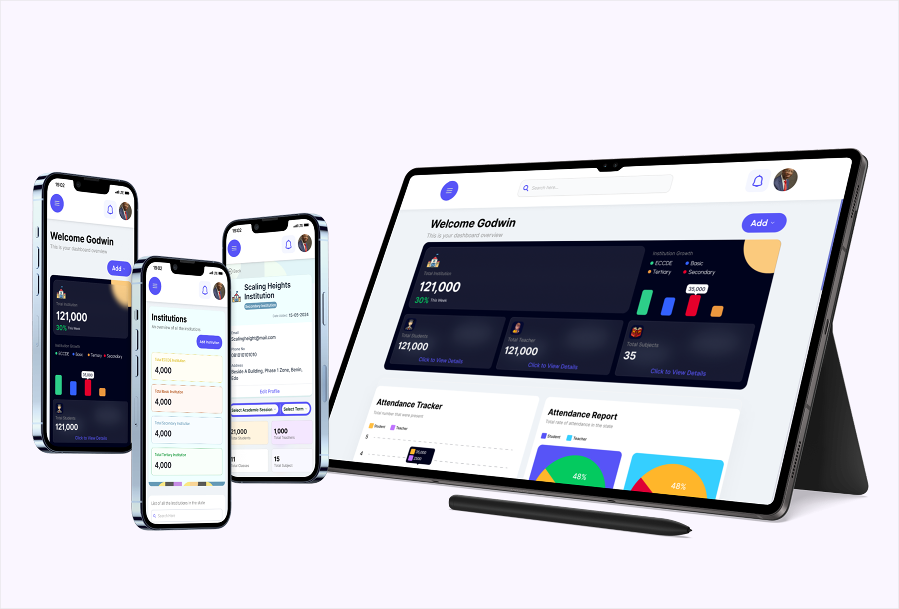
Built to be more robust and scalable, with the ambition to serve a wider set of institutions.
Goal
Create a market-ready product with fuller functionality and a stronger interface.
Approach
Added assignments, live sessions, gamification, advanced reporting, and a visual polish pass.
Insight
The interface looked better, but the product got cluttered. Users found it overwhelming; flows got complex.
Learning
More features don't equal a better experience. Prioritization and focus are what drive adoption.
V3 · Third Version · The Flagship
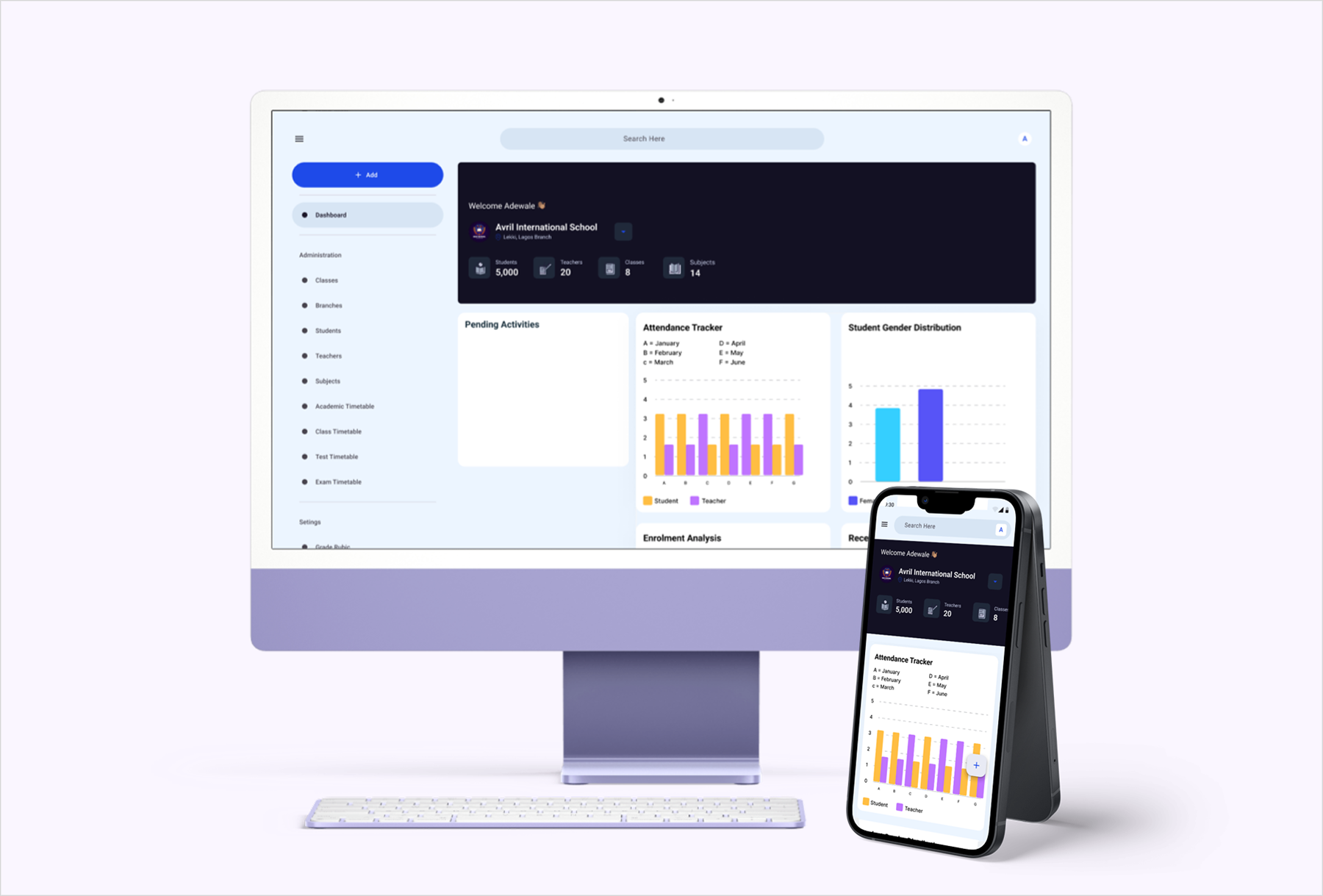
Positioned as Teesas's flagship product, built to be adopted across private, public, and other institutions.
Goal
Streamline the experience for smoother adoption and consistent workflows across institutions.
Approach
Cut feature bloat, simplified navigation, standardized process flows from enrollment through assessment.
Insight
Removing complexity made the product feel lighter and more usable, but raised a new question: how much simplicity before it costs engagement?
Learning
Uniform, intuitive flows drive consistency across user groups, but need careful iteration to protect motivation.
The One Decision
Between V2 and V3, I chose to cut features rather than keep expanding them, even though V2's feature list was what had made it feel "market-ready" on paper. The evidence for the cut was V2's own usage data: engagement dropped as flows got more complex, not despite the added functionality but because of it. I argued internally that Teesas's real competitive risk wasn't "too few features" against other EdTech products, it was inconsistent adoption across institutions with very different technical comfort levels. Simplicity was the feature that mattered most for that audience, and it needed to be defended against the instinct to keep adding.
Leading The Process
Scope
Owned the LMS design end-to-end across three shipped versions, not just the screens, but the sequencing: what to prototype fast, what to validate before building, and when to cut rather than add.
Stakeholders
Worked directly with Teesas's CEO and project manager to keep the roadmap grounded in adoption goals, and with engineering to keep each version's scope buildable inside its timeline.
Defending The Call
Simplifying V3 meant arguing to cut functionality stakeholders had already seen and liked in V2, using V2's own engagement drop as the evidence, not a design opinion.
What Followed
This scope of ownership, running iteration cycles, defending tradeoffs with data, aligning cross-functional stakeholders, is what the following year's Design Manager role was built on.
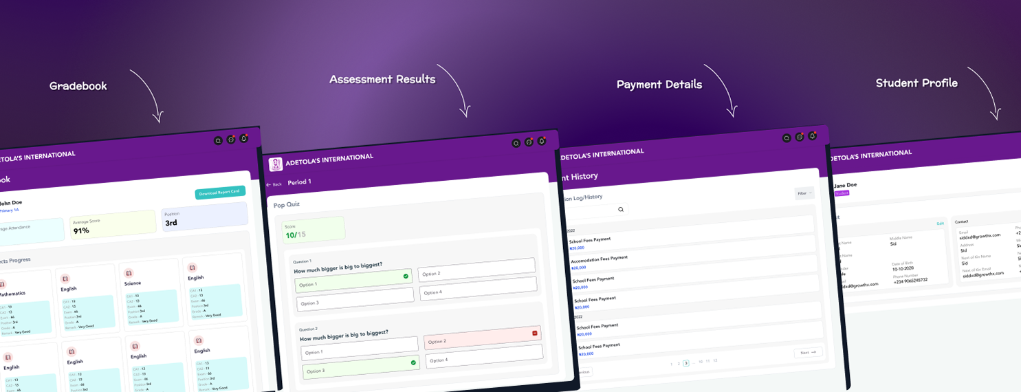
Current Version · Screens
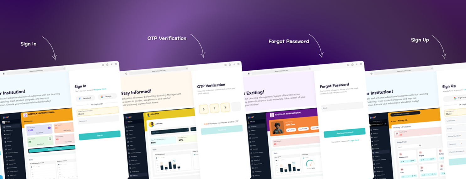
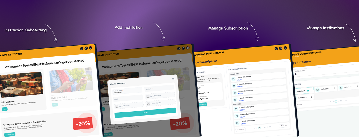
Onboarding
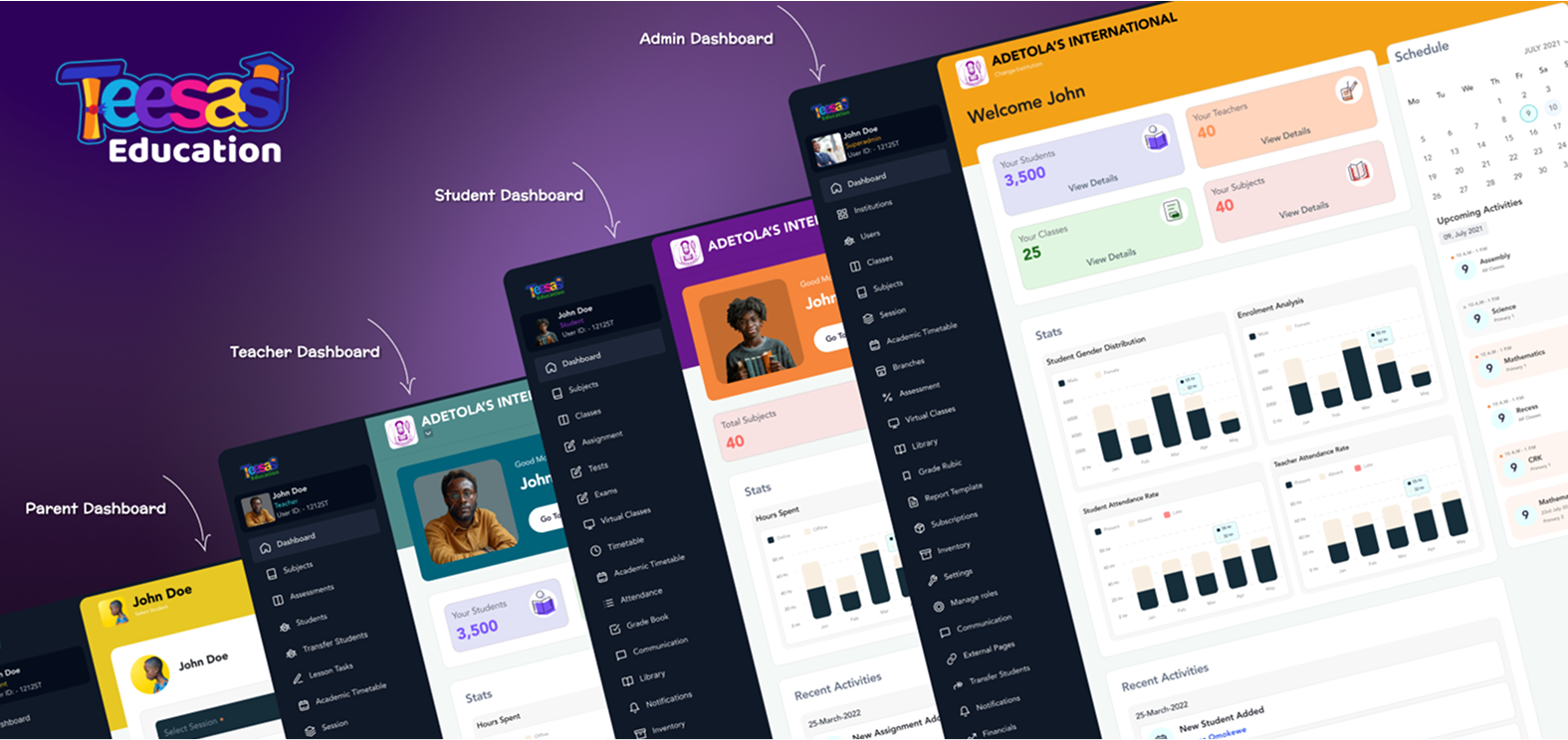
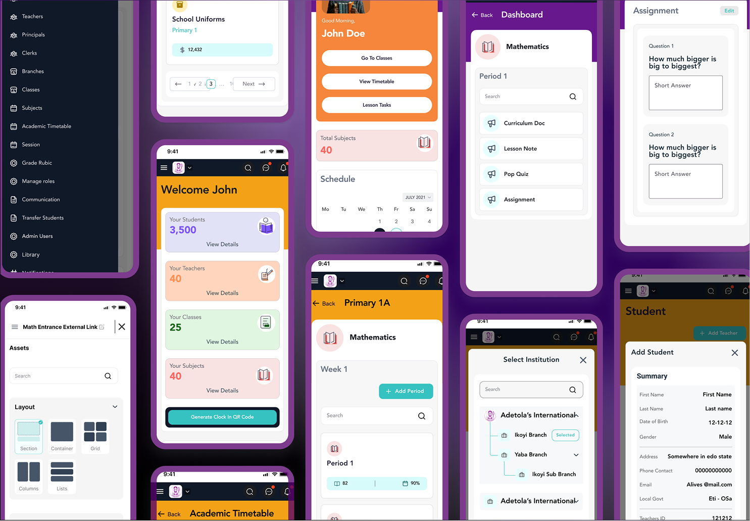
Seamless, role-specific onboarding for teachers, students, and parents, introducing key features progressively so setup takes minutes, not a tutorial.
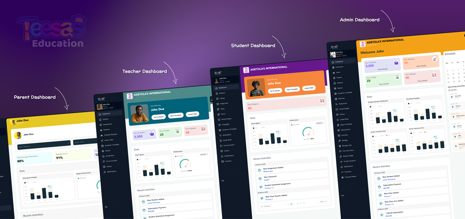
Dashboard
The central hub, tailored per role, classes, schedules, progress, or announcements surfaced first depending on who's looking.

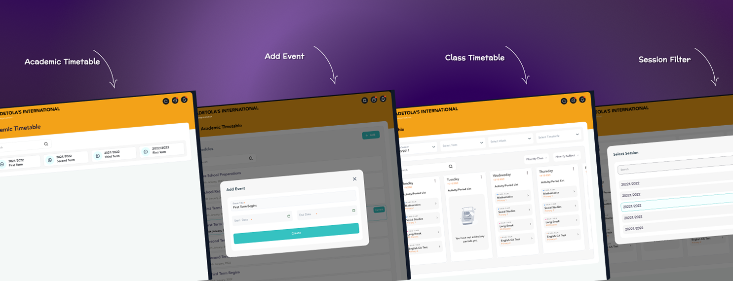
Sessions & Timetables
Academic sessions and schedules in a kanban-style view with type filters, keeps students on track and teachers on schedule.

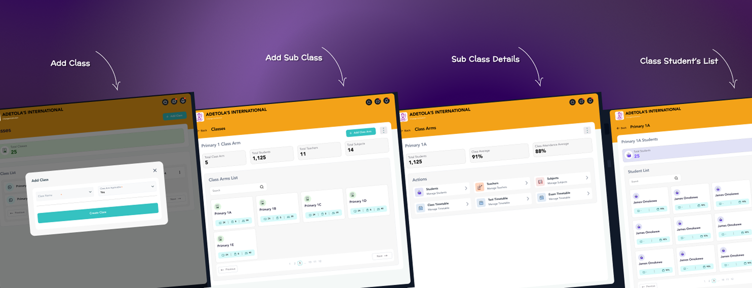
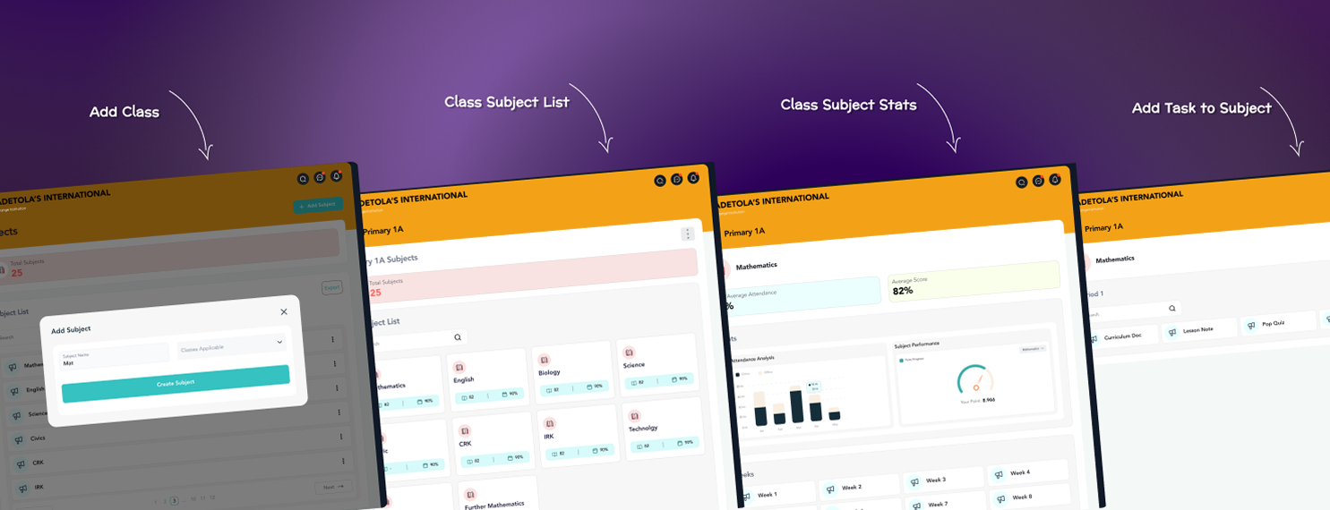
Classes & Subjects
Structured class creation, enrollment, and curriculum configuration, built to stay consistent across institutions of very different sizes.
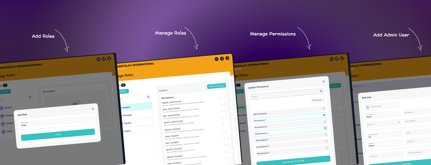
Roles & Permissions
Permission management across administrators, teachers, students, and parents, flexible enough for institutions to customize access without losing clarity.
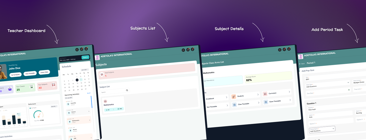
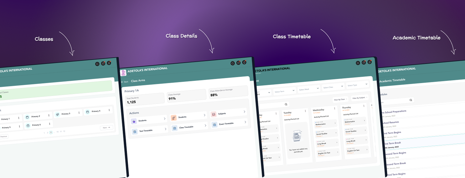
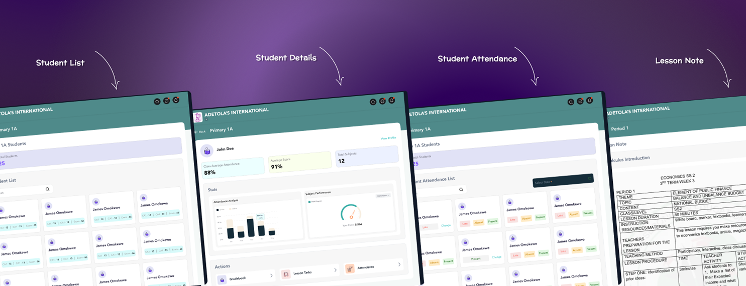
Teacher Portal
Lesson planning and grading with minimal admin overhead.
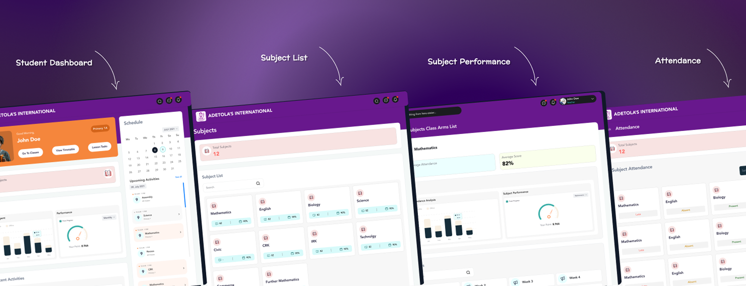
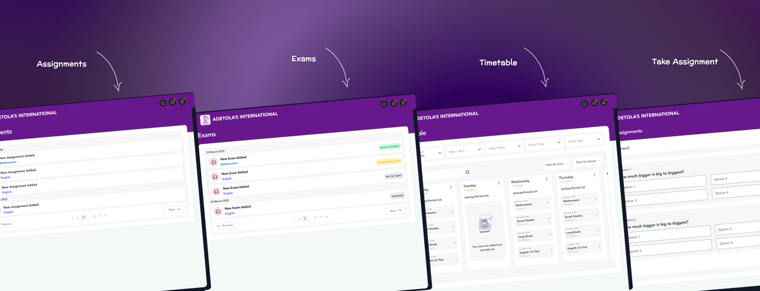
Student Portal
Assignments and progress with an emphasis on independent use.
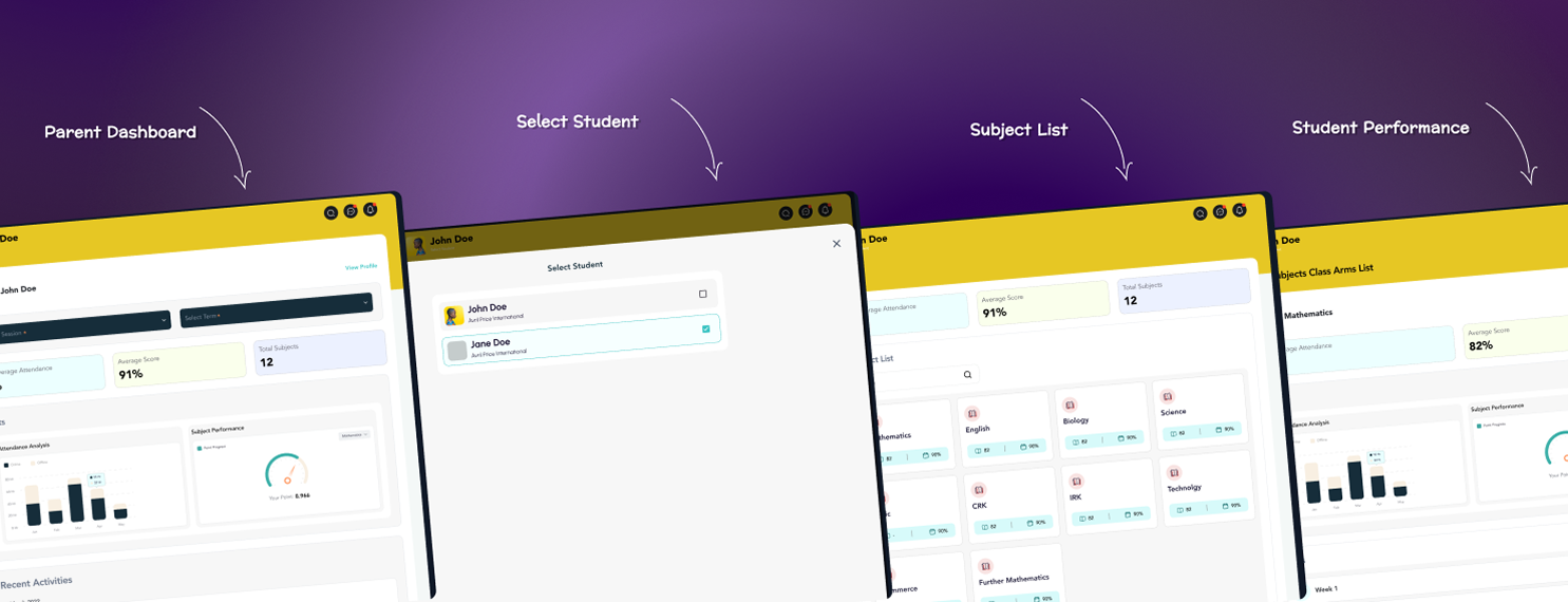
Parent Portal
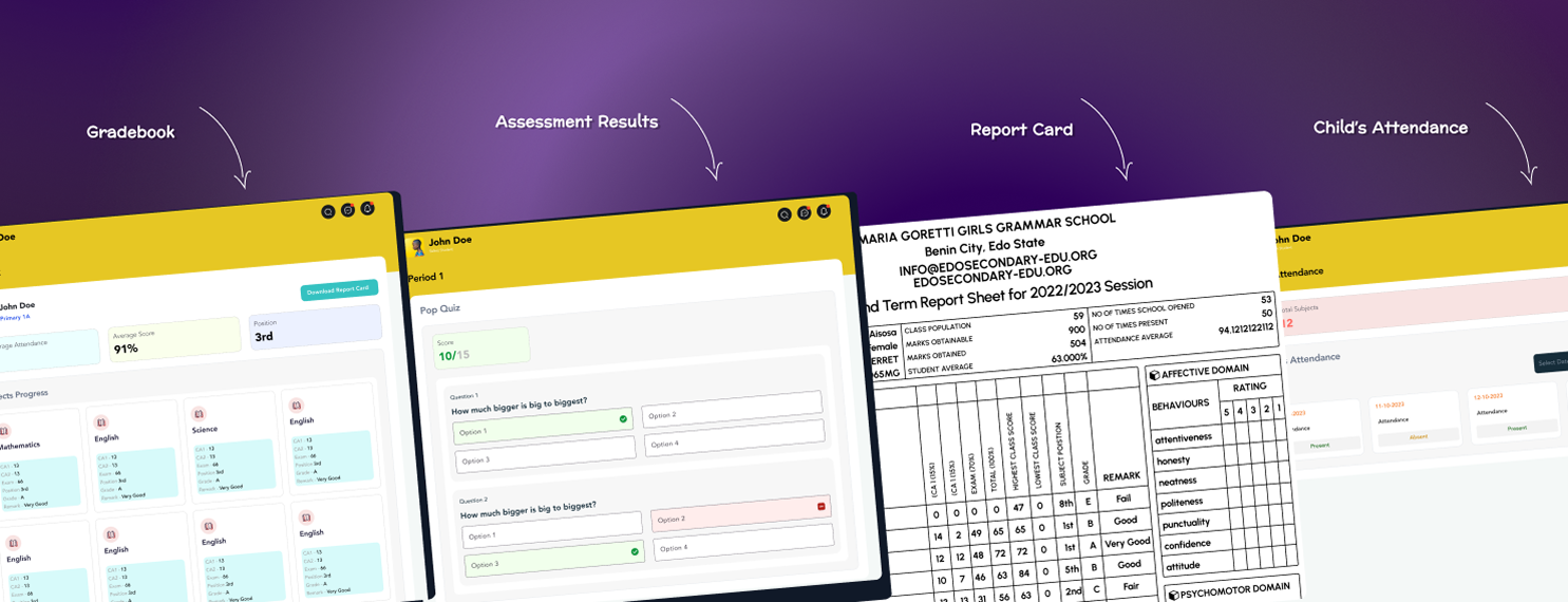
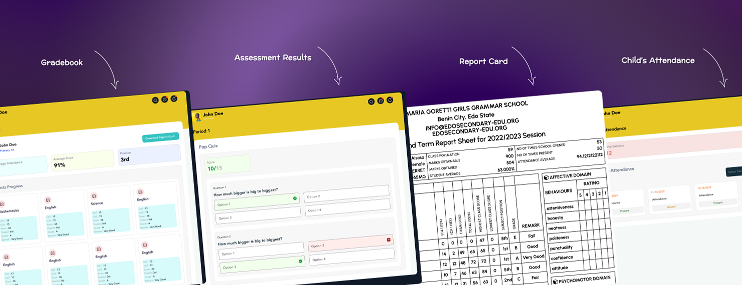
Attendance, performance, and upcoming activity, oversight without overload.
Other & Responsive Screens
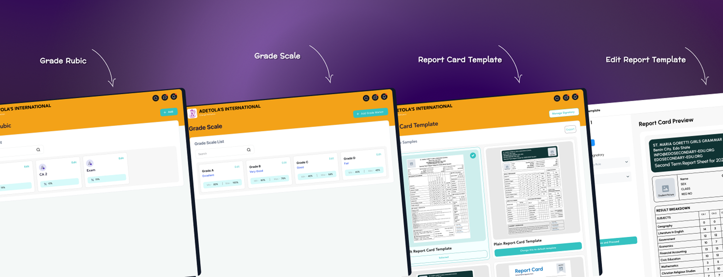
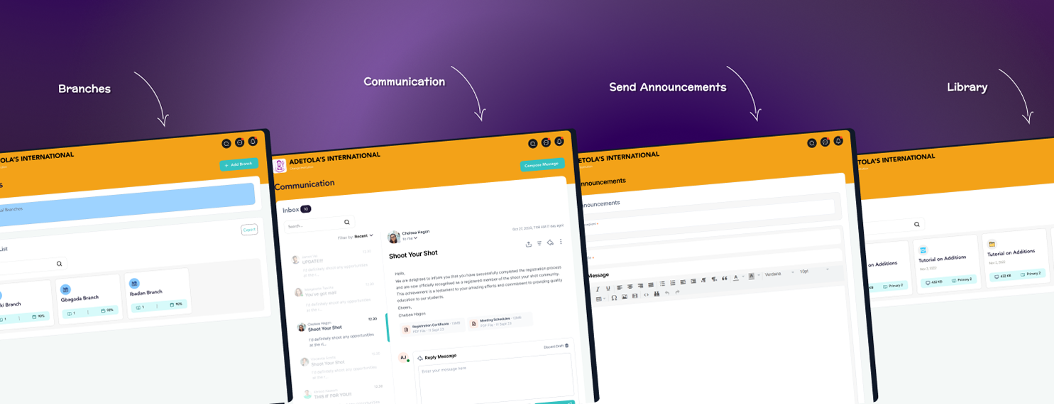
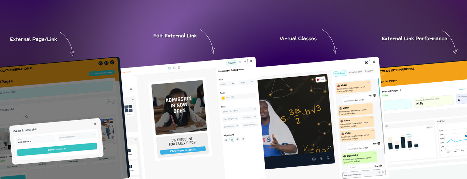
Messaging, settings, grading, and reporting were designed for consistency with the core flows, across desktop, tablet, and mobile.
Evidence of Impact
Measured across the first 6 months of the current (V3) version:
Adoption
20+
Schools deployed on the platform, a mix of private and public institutions.
Engagement
+35%
Increase in average student login frequency versus the previous version.
Efficiency
-40%
Reduction in teacher time spent setting up classes and managing assignments.
Parent Visibility
70%+
Of parents in pilot schools actively used the parent portal to track progress and attendance.
Satisfaction
82%
Overall satisfaction rating, a significant jump from earlier versions.
What Would Prove This Wrong
The bet was that simplification, not new functionality, was what would move adoption. If engagement had stayed flat or dropped after V3's cuts, that would have meant clutter wasn't the real blocker, and the next test would have been pricing, onboarding friction, or school-level training instead of interface complexity.
Next Steps

Advanced Analytics
Richer reporting dashboards so admins and teachers can track outcomes in real time.
Personalized Learning
Adaptive learning paths tailored to each student's strengths and gaps.
Offline Accessibility
Offline-first support for institutions in areas with limited connectivity.
Third-Party Integrations
Content providers, assessment tools, and payment systems to extend platform utility.
Reflection
This project reinforced that iterative design isn't a slide in a deck, it's shipping something real, watching where it breaks, and being willing to cut what you built the last time. Balancing four user groups with genuinely different needs meant the hardest work wasn't any single screen, it was deciding what NOT to build for V3 after V2 had already proven those features could ship. Great design here was less about adding capability and more about creating flows that let every role succeed without training.
Status: Live, deployed across partner schools. Metrics above are Teesas's internal reporting for the current version's first 6 months.