Sun King · Smartphone Marketplace
Read The Page, Rebuild It, Fix It
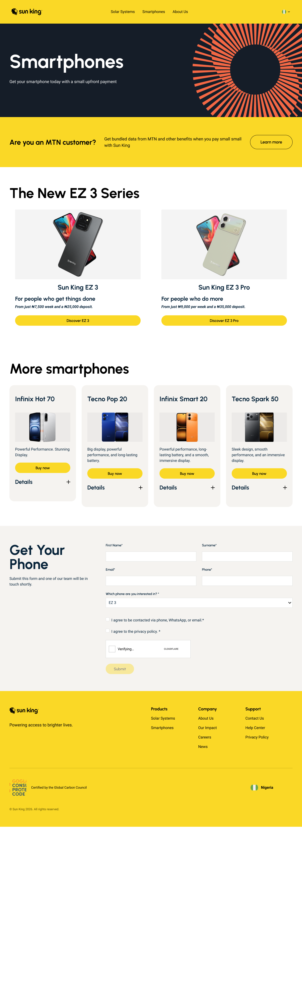
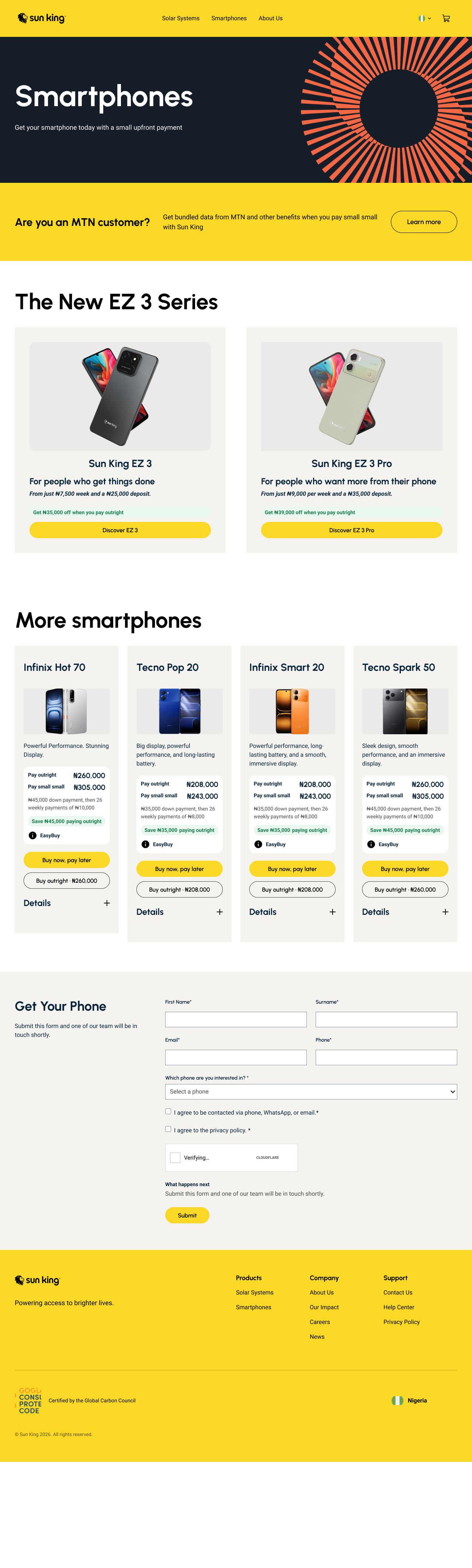
I read Sun King's smartphone page twice with Valideity, rebuilt it in Figma with my design skill, tested it with 5 simulated shoppers, then redesigned it from what they found. Installments stay the main path. The total cost is now visible, pay in full is a clear second option, and every form and button works.
An independent exercise on Sun King's public page, not a Sun King project. Every finding comes from AI personas, and the prices in my redesign are assumptions.
Research
My view going in: the page makes people do the sums, and an enquiry form may not suit someone who expects to buy online. Two Valideity reads tested that.
At A Glance
See Result ↓Read 1: AI First Read
-
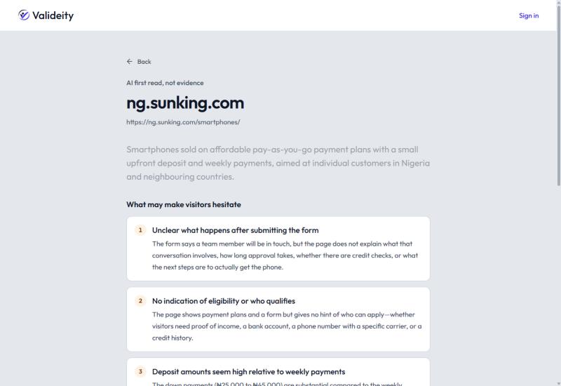
After you submit
The form says a team member will be in touch, but not what that involves or how long approval takes.
-
Who qualifies
Nothing says if you need proof of income, a bank account or a credit history.
-
Deposits
₦25,000 to ₦45,000, with no word on refunds or missed payments.
Another run also flagged the sums: 10,000 a week for 26 weeks plus 45,000 down is 305,000, with no cash price to compare.
Read 2: Live Page, 5 Personas
-
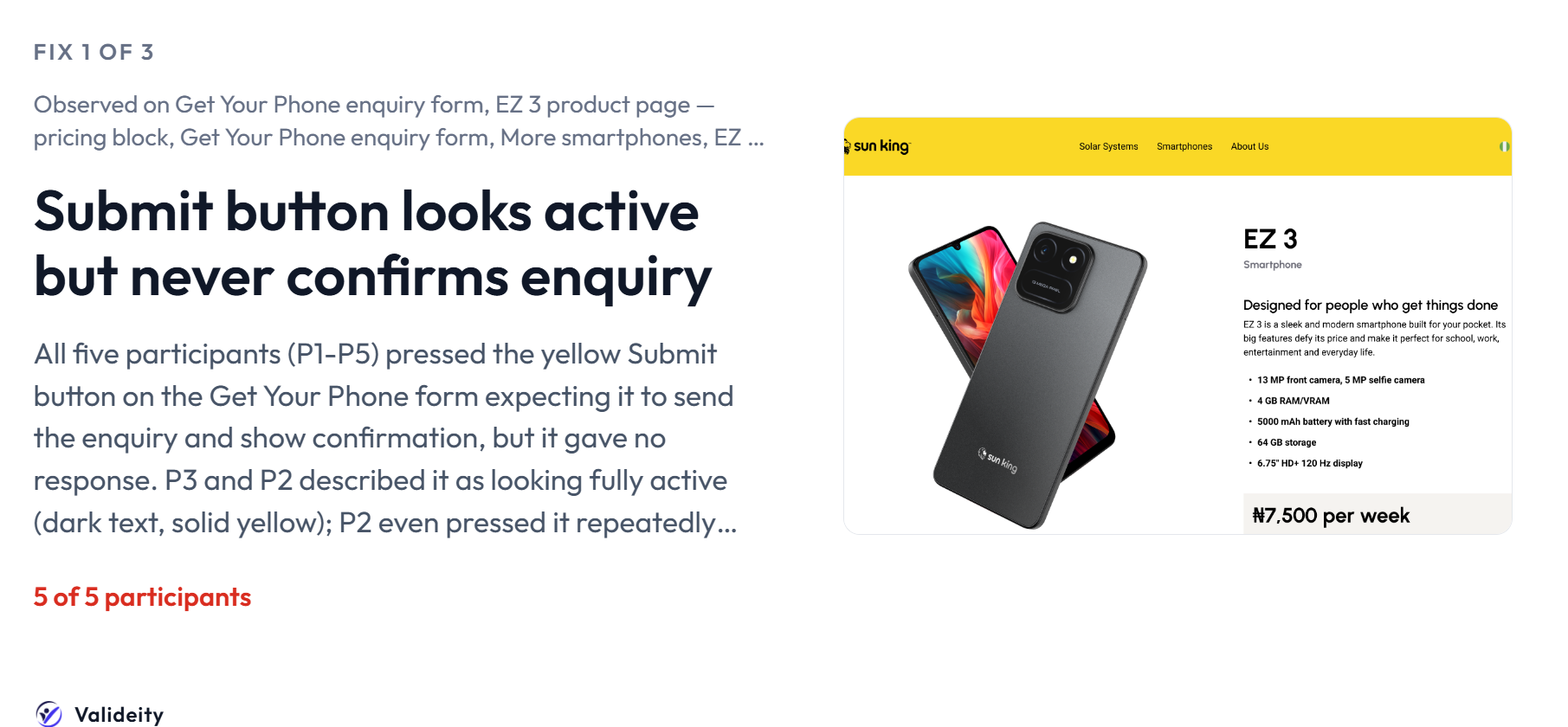
5 of 5
saw no prices until they scrolled past the MTN banner.
-
5 of 5
hesitated on the featured EZ 3 phone cards.
-
4 of 5
found "pay small small" undefined: no amount, frequency or term.
8 findings in all. The report scores the page 51 ("Mixed"). That is a prediction and Valideity's scoring is still being tuned, so I rely on the findings, not the number.
The Five Simulated Shoppers
-

Lagos Small-Business Owner
On an entry-level Android with unstable data.
-

Nigerian Installment Smartphone Shopper
Plans around weekly payments.
-

Nigerian Online Shopper Professional
Buys online, works in an office.
-

Budget Smartphone Comparison Shopper
Compares phones on price.
-

Cautious Lead-Gen Form Filler
Salaried office worker.
Illustrations, not photos. These personas are simulated, not real customers. Avatars: Avataaars by Pablo Stanley, via DiceBear.
First Read
Live Report
Rebuild
I used my UI Design with MM skill to rebuild the page in Figma: the same 7 sections in the same order, every part a reusable component. That gave me a faithful copy to test and change safely.
I ran the rebuild through Valideity before editing it: 5 friction findings, 4 high severity. The pricing finding matched the live page. Two pointed at my rebuild, not Sun King's page: the buttons and form were not wired up yet. On the live page they work.
/ui-design-with-mm Rebuild the Sun King smartphone page in Figma. Same 7 sections, same order. Copy verbatim from the live page. Every repeated part a component.
- Deliberate: ask a few questions, or proceed on stated assumptions
- Research: read the live page and measure it
- Foundations: tokens, primitives feeding semantic roles
- Components: atoms up to pages, all in Auto Layout
- Verify: bindings, states, a side-by-side with the source
An illustrative prompt. The steps are the skill's own stages.
Redesign
The same skill updated the design from the findings, on a separate AFTER page. The rebuilt original is untouched.
What Changed
-
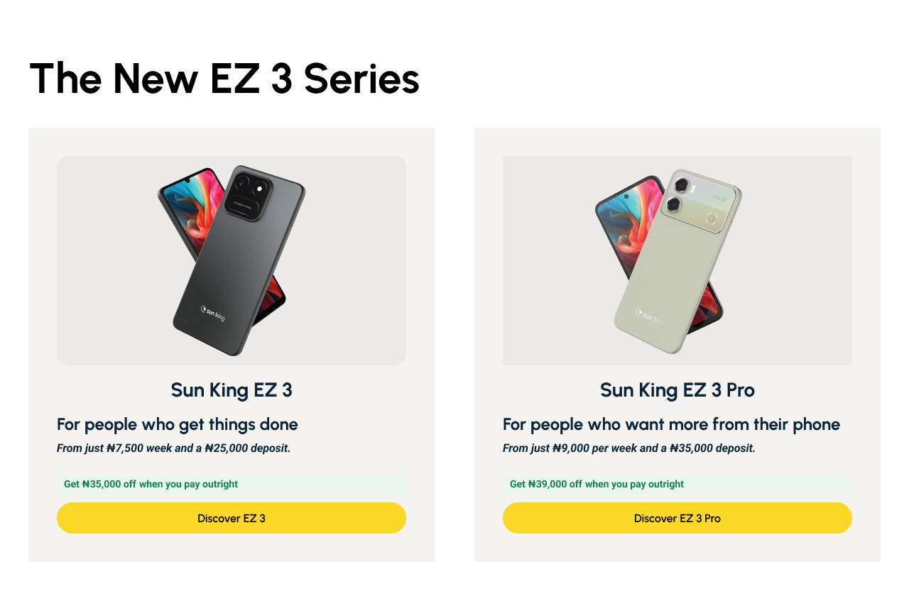
Total cost is visible
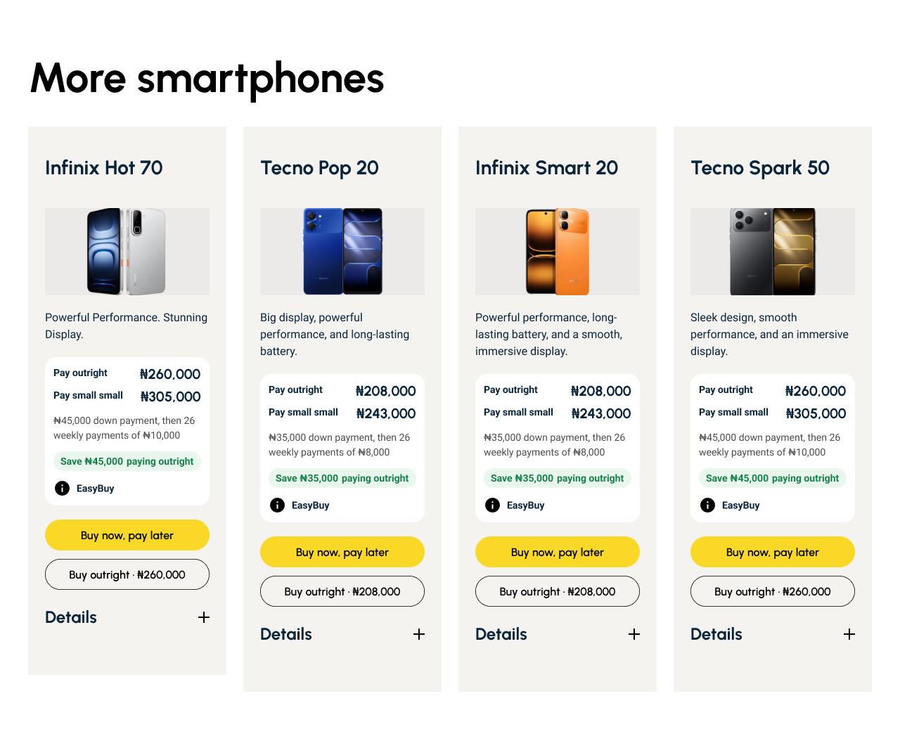
Each card shows the pay-small-small total, with the pay-in-full price and saving beside it. Installments stay first.
-
Pay in full
Buy outright runs through cart, checkout and success as a prototype. No payment is taken.
-
Prices on the card
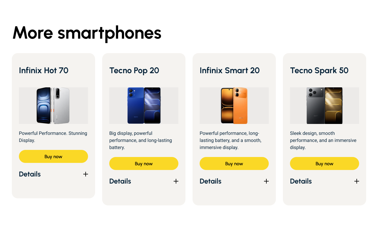
Four phones had their financing line hidden in "Details". It now sits on the card face.
-
Forms
Visible labels, error and submitted states, and a line on what happens next. Field borders went from 1.46:1 to 5.3–5.8:1 contrast.
-
Buttons
0 dead controls across 66 tap targets. Buttons scroll to the form and show feedback.
How The Method Shaped It
-
Copy from the live page
Anything unconfirmed is marked "open question", not invented.
-
Everything is a component
14 cards come from 1 component and 4 forms from 1, so one change updates every card or form.
-
Nothing is hard-coded
0 unbound text, fills, strokes, radii or spacing, so real prices drop in without redesign.
-
Inside what was approved
Sections keep their order, installments stay first, and each new screen was agreed first.
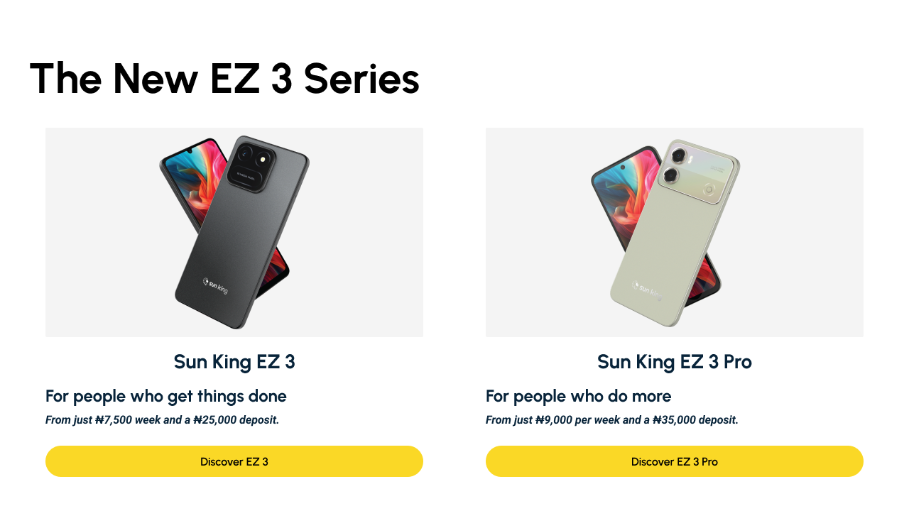
Featured Phones
The cards now show the pay-in-full saving. Discover is still the main action.
More Smartphones
The price moves out of "Details" onto the card, with pay in full beside it. The pay-in-full prices are my assumptions.
The Get Phone Form, Step By Step
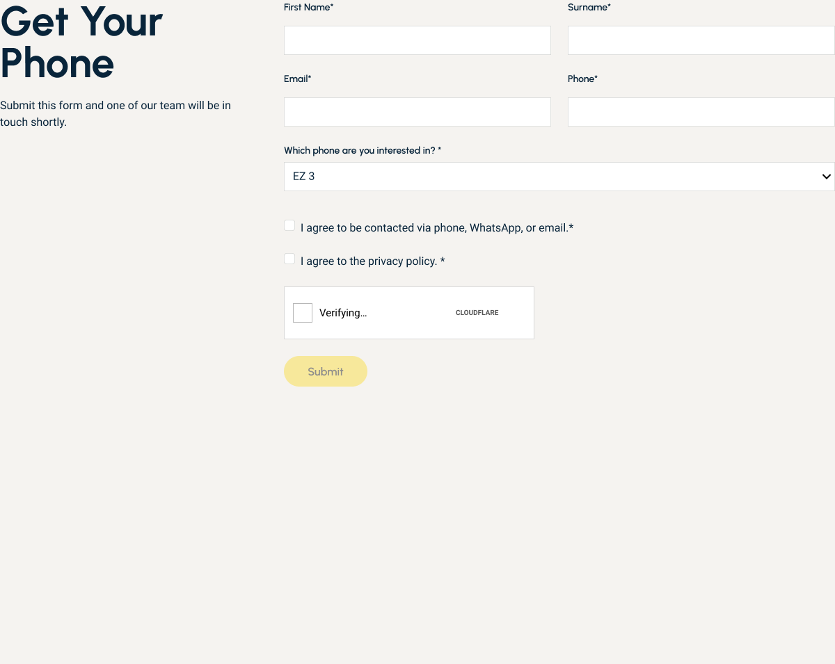
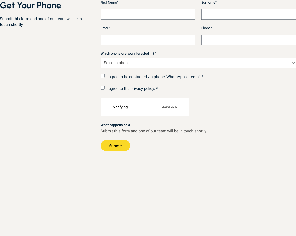
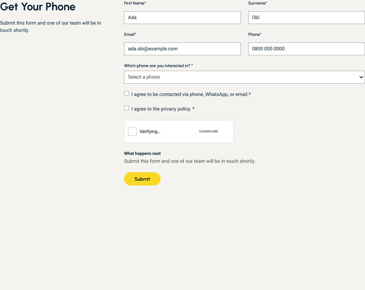
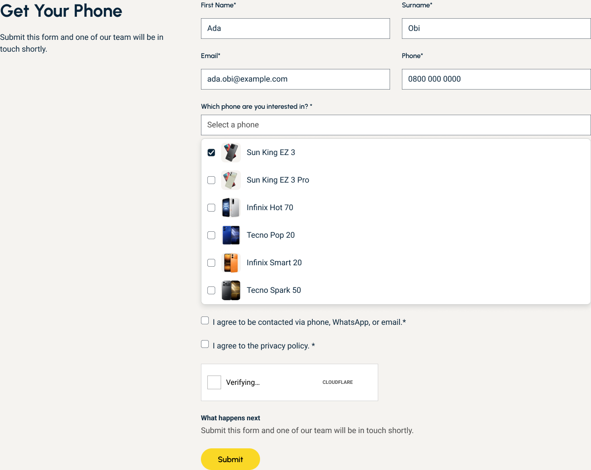
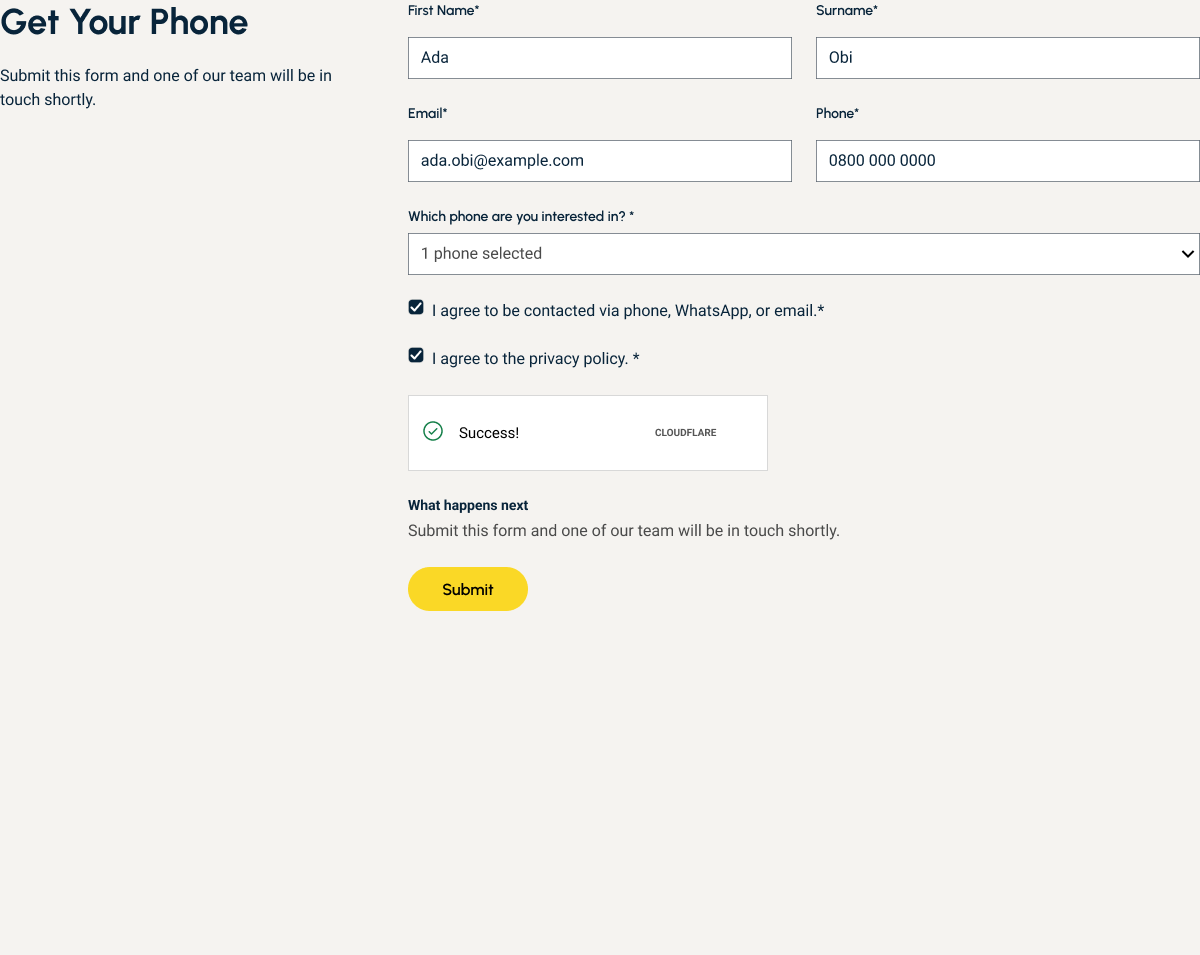
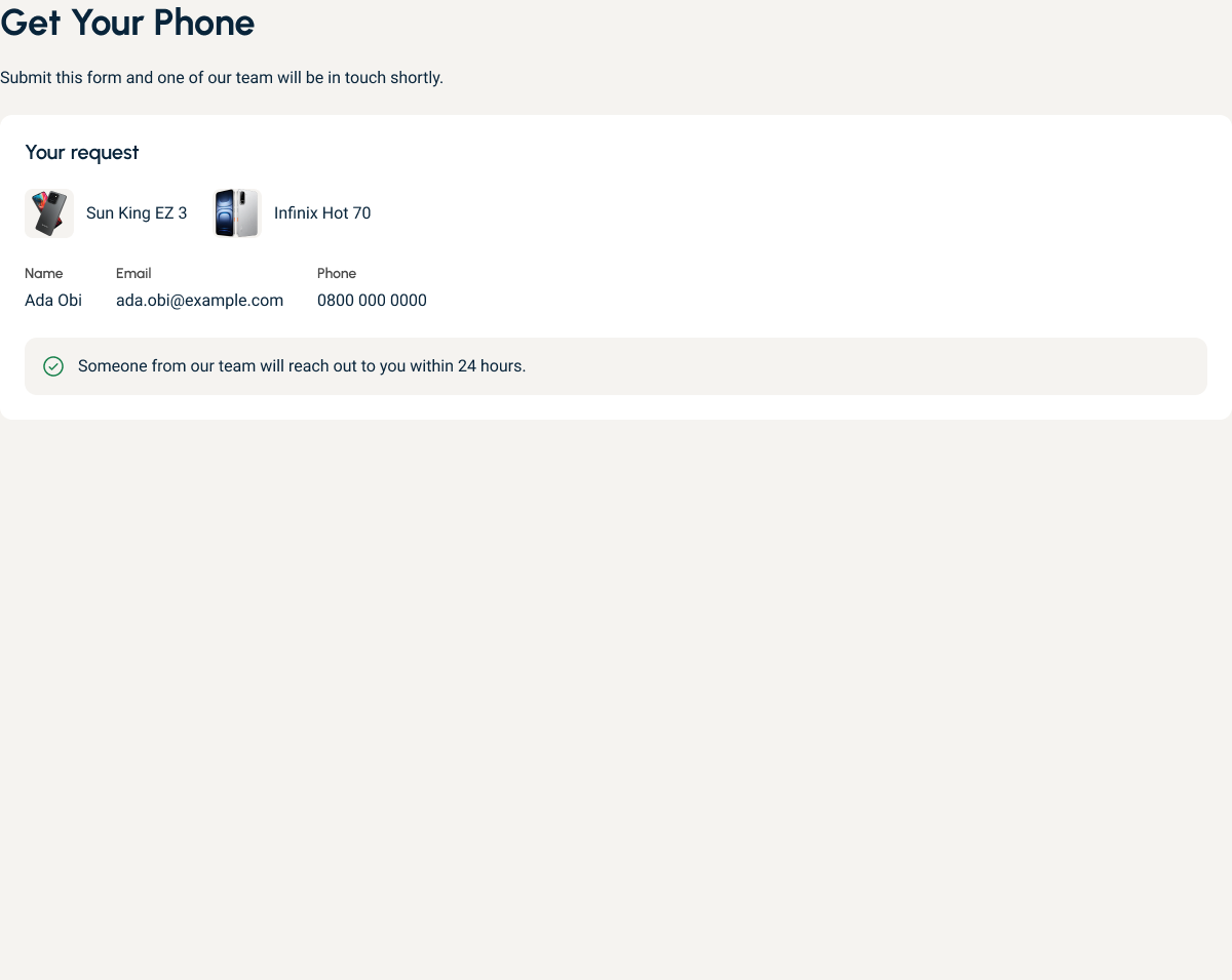
Before: the original form, with someone else’s details already in the fields
Prompts
Redesign, prompt by prompt
10 of 10 promptsThe core redesign took 10 prompts in about 2.5 hours. These are my own words, shortened, with what each one produced.
-
0 min
"Use /ui-design-with-mm. Edit and update the existing Sun King smartphone designs in Figma… treat the Valideity study as a lead, not a measurement."
Findings triaged. Page duplicated as AFTER.
-
15 min
"Approve all choices A to I with the recommendations. Pace: Procedural."
One product card and one form, built as components.
-
26 min
"Approve J: show each of the four phones' confirmed financing line on the card face, verbatim."
Four cards show their financing line.
-
48 min
"Round 2 on the AFTER page: the outright purchase path. Reuse the Round 1 components; do not rebuild them."
Cart, drawer, checkout and success planned.
-
52 min
"Approve the Round 2 plan with the recommended options 1-9, and continue Round 1 wiring."
Cart path built. Every control wired.
-
91 min
"Op is Opay. Prices are fine."
Open question closed. Prices confirmed for the design.
-
116 min
"Can we try this for the More smartphone cards… you can hide things in details."
Compact price comparison on the card.
-
122 min
"1.b, use the same logic, assume a lesser price."
Assumed prices, marked as assumptions.
-
137 min
"Yes, add it, but do the other More smartphones too. Make sure the details match for each."
All four cards match.
-
144 min
"Cart holds one phone line at a time (quantity 1-3); adding a different phone replaces it. Wire Buy outright on all four, plus EZ 3 and EZ 3 Pro."
Buy outright works on all six phones.
16 more prompts went on polish: form fills, the verify tick, card spacing and hierarchy.
What I Found
I ran the updated design through Valideity too. In 19 simulated sessions, none chose Buy outright, and 9 looked at it and decided against it, mostly on cash flow. So installments stay the main path.
What This Does Not Show
It is a pointer, not proof. Most of the personas were installment shoppers by design, and the page leans that way too. No real customer took part.
Next
Test with real Sun King customers.
Conclusion
The research kept finding the same friction: people could not see what a phone would cost, and the path from a card to a finished enquiry gave them no feedback. The redesign removes both without touching Sun King’s model. Installments stay the main path. The total and the pay-in-full price sit on every card, so no one does the sums. Every button responds, and the form says what happens next. The page now answers the questions people hesitated over.
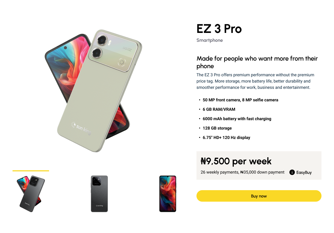
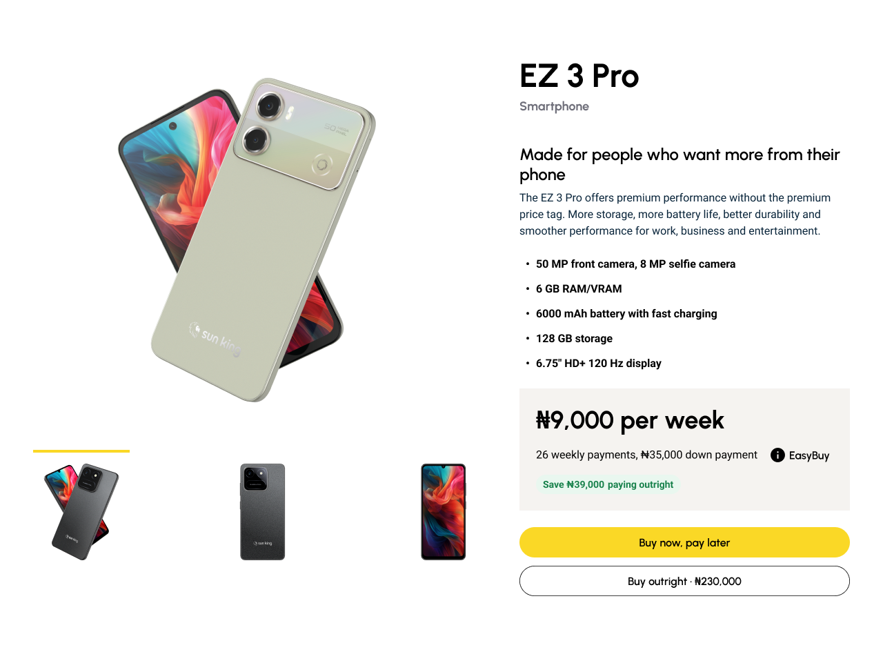
Figma File
The method behind it
/ui-design-with-mm
Deliberate, research, build tokens and components, then verify. Free to download and use.
DownloadThe Skill
Status: Independent proposal with a working Figma prototype, not shipped and not a Sun King project. Prices are my assumptions. All findings are predicted by AI personas and need confirming with real customers.
Other Projects